
Design Case Study: CSS3 Gradient Tips & Tricks
Introduction
I recently had the pleasure of being part of the team at Endertech that designed and developed the marketing and API documentation website for EdgePay, a new full-service payment gateway and merchant account provider. I was doubly excited to be both the creative director and frontend developer for the marketing part of the site, which we built in Drupal 8. In this day and age, it’s critical for web designers to also have solid knowledge of HTML and CSS, so they can understand the flip side of designing the UI of a website: actually implementing it. In the case of EdgePay, I got to take on both roles, and I learned some neat CSS3 tricks along the way. In this article, I’ll detail some of what I learned by focusing on the homepage hero banner, which represents some of the advanced CSS functions we employed throughout the site.
I was especially impressed by the complex and refined background styles that nowadays can be achieved through standard CSS alone, effects which historically would have required prebaked background images or hacky methods. There are many advantages to using pure CSS as opposed to images, which can be heavy and slow-loading, can appear blurry or distorted, and can complicate implementation of a responsive design that needs to work on both desktop and mobile. Elegant and well-designed CSS, on the other hand, loads in a snap, is always pixel perfect, and can be implemented in a way that works for both desktop and mobile without having to manage multiple sets of assets for different device types.
Now let’s take a more in-depth look at how Endertech leveraged CSS3 to translate EdgePay’s contemporary branding to a bespoke responsive website.
Hero Banner Overview
Here’s a screenshot of the EdgePay homepage hero banner:
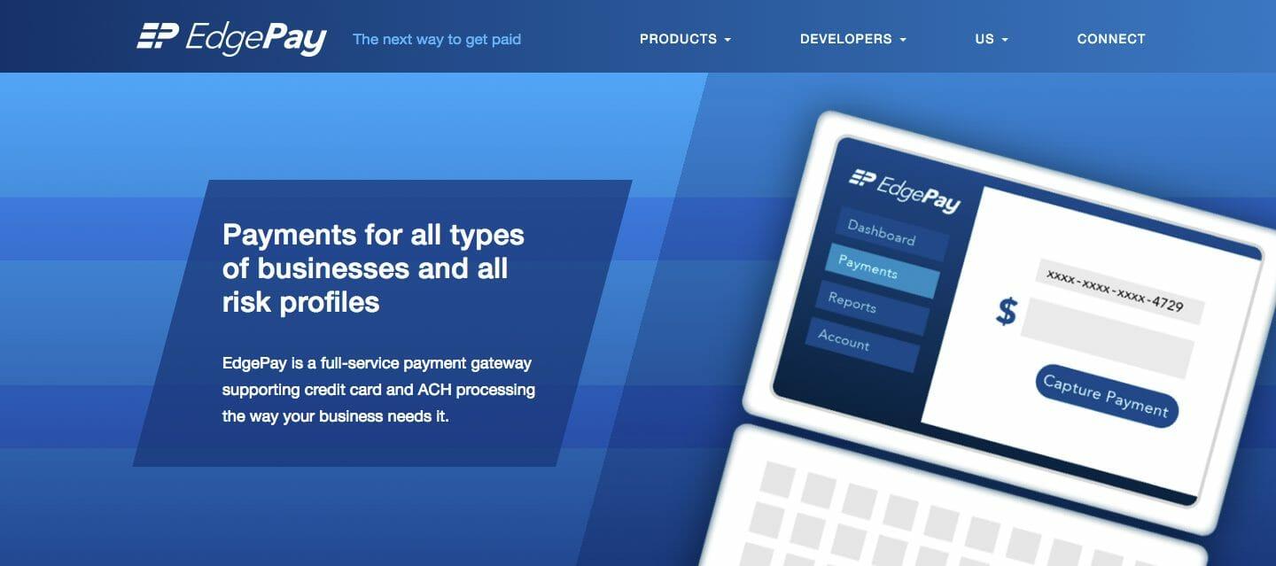
There were several different challenges in implementing the design, including the rhomboid shape of the text box. However, let’s focus on just the background:
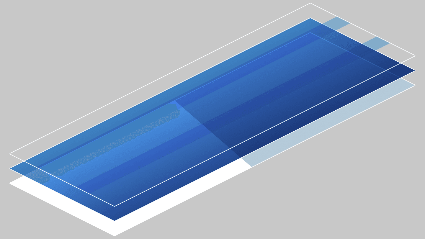
The hero banner’s CSS background attribute actually contains three discrete elements layered on top of each other to achieve the full effect. The base layer is a rotated linear-gradient with a sharp transition between color stops, which divides the hero banner space in half horizontally and echoes the slant of the EdgePay logo (which, by the way, Endertech also designed; you can read a case study here). On top of that, there’s a simple top-to-bottom linear-gradient, which fills in most of the color. Finally, the top layer is a repeating-linear-gradient, which produces the horizontal bands that, again, echo the “EP” symbol of the logo.
Here’s a mockup that illustrates the three layers and how they interact optically to produce the final effect:
Here’s the full CSS:
background: repeating-linear-gradient(transparent 0%,transparent 25%,#a7dcff 25%,#a7dcff 37.5%), linear-gradient(#24a5f9,#034792), linear-gradient(105deg,transparent 0%,transparent 50%,#b4cad9 50%,#b4cad9 100%); background-blend-mode: multiply; |
In the shorthand background attribute, the first gradient is the top layer and the last is the bottom layer. The order is important because each layer will occlude any layer underneath it, or otherwise affect it depending on the background-blend-mode used. We’ll get to that attribute later, since it’s important, but for now let’s take a look at each background layer individually.
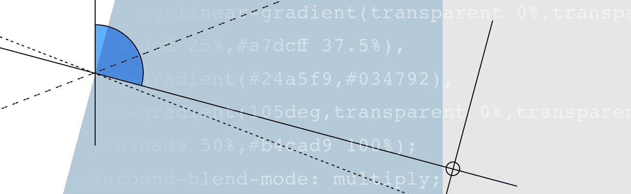
Layer 1: Linear Gradient with Rotation
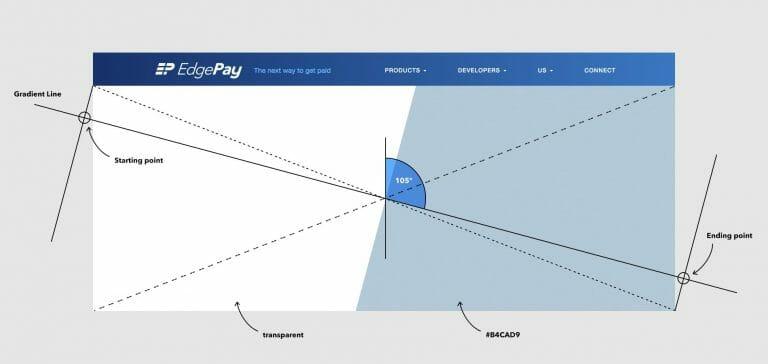
The basic structure of the hero banner is a two-column layout, which is emphasized by the strong diagonal line running down the center of the box. In our CSS, this effect is achieved by a linear-gradient rotated 105 degrees clockwise from the vertical. Here is an annotated screenshot:
Here’s the CSS for this layer:
|
And some key things to note:
By default, a gradient will be vertical, with the first color stop located at the top of the box, and the last at the bottom; this could be explicitly defined with “to bottom” or “0deg,” but it’s not necessary. To rotate the gradient clockwise away from the vertical, you can define the amount of rotation in degrees or as a fraction of a complete turn (e.g., “.25turn” equals “90deg”). In our example, we have specified 105 degrees.
The starting and ending points for a rotated gradient are the points along the gradient line where imaginary perpendicular lines originating from the closest corners of the box intersect the gradient line.
To produce two solid bands of color, we need to define four color stops. In our example, the second and third color stops are actually placed at the same point down from the origin point of the gradient: 50%. This is what produces a sharp color transition, rather than a gradient per se.
Layer 2: Vertical Linear Gradient
With the base layer in place, we’ve blocked out the basic structure of the hero banner, but it still looks pretty bare. To fill in more color, we layer another linear-gradient that produces a gradual transition from lighter blue at the top to darker blue at the bottom. Here is a screenshot of the isolated layer:
And here’s the CSS:
|
This is by far the simplest CSS of the three gradient layers in our background. Indeed, our notation contains just the minimum elements needed to define a linear-gradient.
As noted before, a gradient will be perfectly vertical unless a rotation is specified.
Additionally, the minimum number of color stops is two. Since we want a progressive and consistent transition between the two end-point colors, we don’t need any additional color stops, and we don’t need to define the color stops’ positions, as we did with the first layer, since by default they’re placed at the top and bottom of the box (equal to 0% and 100%).
Layer 3: Repeating Linear Gradient
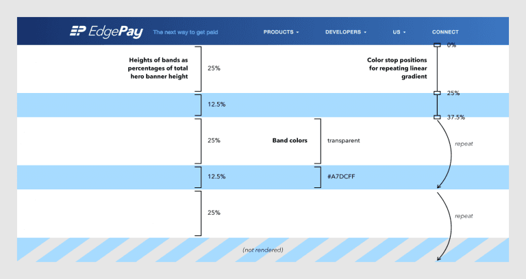
With the first two layers in place, we have a final layer to add: the two blue horizontal bands that echo the letterforms of the “EP” symbol in the EdgePay logo. We’ve rendered them with a repeating-linear-gradient. It’s similar to a linear-gradient, but the length of a repeating-linear-gradient doesn’t cover the entire box on its own, and the gradient repeats as many times as necessary to do so. Here’s a screenshot of the isolated top layer with some notes about what’s going on in terms of defining the bands of color:
Here’s the CSS just for this layer:
background: repeating-linear-gradient(transparent 0%,transparent 25%,#a7dcff 25%,#a7dcff 37.5%) |
And, as before, some notes to make sense of all of this:
Although the layer is made up of five bands, alternating transparent and blue, if we break them down in terms of percentages of the total hero banner height, we find that we can simplify the definition of the gradient to just two bands of color, repeating them to create the final effect. We could have used a more complex
linear-gradientto explicitly define all five bands of color, but this is a good example of where using a
repeating-linear-gradientcan be more efficient.
Although the gradient is repeated three times, we don’t see six bands of color on the screen (2 bands x 3). The last blue band is hidden because the gradient will add up to 100% of the box height when it is repeated. The way we’ve defined the gradient, repeating it three times adds up to 112.5% of the element height; the extra 12.5% is the third blue band, which doesn’t get rendered.
As is the case with a
linear-gradient, arepeating-linear-gradientby default begins at the top of the box and repeats vertically from there without any rotation, so we don’t have to explicitly include “to bottom” or “0deg” in our shorthand CSS as those values are implied.
The Final Piece: Background Blend Mode
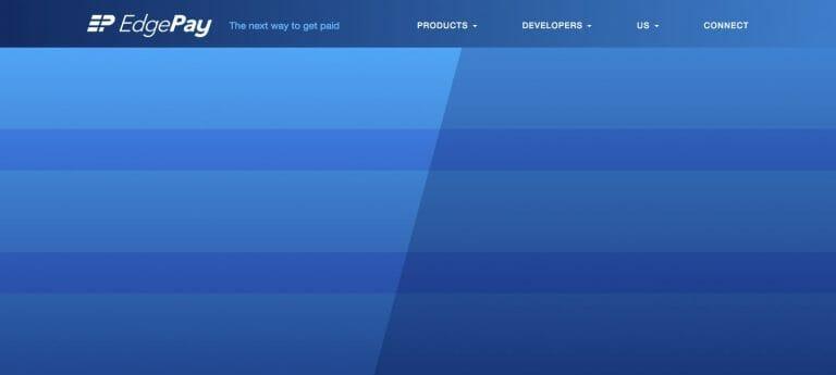
We have all three layers in place, but without a background-blend-mode specified, this is what we see:
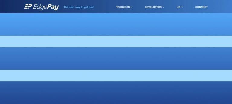
Because the top repeating-linear-gradient has transparency in it, we can see the darker blue linear-gradient behind it. However, the repeating-linear-gradient is too bright, and the bottom layer, with the diagonal line running down the middle, is completely hidden because of the middle layer.
This is where the background-blend-mode attribute comes in. If you’ve ever used Photoshop or other common graphics editing programs, you’ll be familiar with the possible values: multiply, screen, overlay, etc. You can see a full list of blend modes here. I could devote a whole separate article to the details of how blend modes work, but basically, blend modes take the color values of the two or more layers and manipulate them in a mathematical way. If you blend two colors with multiply, the resulting color will be darker than either of the two source colors (unless one of the source colors is white, in which case the resulting color will be the same as the darker of the source colors). Conversely, blending two colors with screen will result in a color that is lighter than either of the two source colors (unless one of the source colors is black, in which case the resulting color will be the same as the lighter of the source colors). The precise mathematical manipulations for the other blend modes get even more esoteric, but hopefully these two examples give you the basic idea.
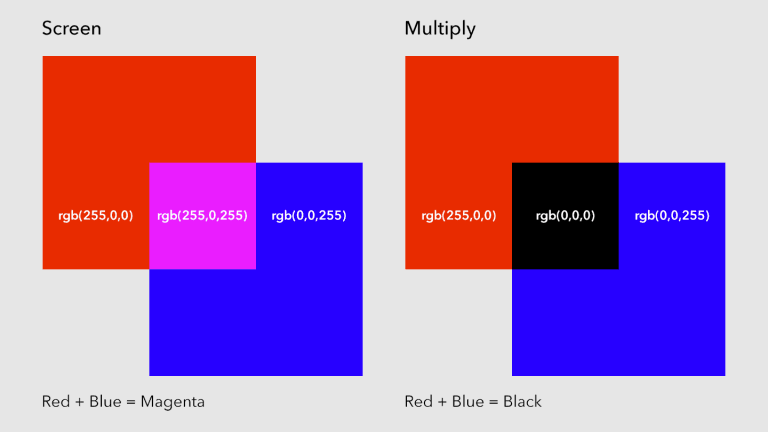
In the case of our hero banner, we’re using multiply:
|
With the blend mode in place, we see the final result:
Voilà! I hope that this focused look at a single user interface element has illuminated a few of the powerful CSS functions that web designers and frontend developers have at their disposal these days. There’s much more to the linear-gradient, repeating-linear-gradient, and background-blend-mode functions than I’ve laid out in this article. For an even deeper dive, check out the following pages, which I found useful in putting together this post:
“Using multiple backgrounds.”
MDN Web Docs, Mozilla and individual contributors,
“linear-gradient().”
MDN Web Docs, Mozilla and individual contributors,
https://developer.mozilla.org/en-US/docs/Web/CSS/linear-gradient
“repeating-linear-gradient().”
MDN Web Docs, Mozilla and individual contributors,
https://developer.mozilla.org/en-US/docs/Web/CSS/repeating-linear-gradient
“CSS background-blend-mode Property.”
W3Schools, Refsnes Data,
https://www.w3schools.com/cssref/pr_background-blend-mode.asp