

Tailwind CSS: A Short Review

Tailwind CSS is an open-source, tiny, highly-customizable, utility-first CSS framework for rapidly building custom user interfaces. It is a young kid on the block that emerged in 2019. Love it? Hate it? Before you decide, let’s get to know the framework a little better.
In this short article, we will elaborate on the features of Tailwind, along with the pros and cons of the framework. Let’s begin!
Features of Tailwind CSS
Utility-first CSS framework
A traditional, well-established CSS framework typically gives you plenty of default CSS and JavaScript functionality out of the box, including a huge list of components like Modal, Buttons, etc. You can override the defaults to match your brand, but these frameworks can cause opinionated and bloated code. The loss of knowledge of the underlying css can make it harder to make changes without knowing what else it will affect. It tends to get bloated and become difficult to maintain.
In contrast, Tailwind discourages overriding of the existing rules. Instead, it provides enough small building pieces to cover every CSS styling needs. This is the definition of “utility-first”. The framework gives you a lot of utility classes like margin, padding and font-weight without having to create your own CSS classes.
Examples of pre-built TailwindCSS classes:
m-5 translates to “margin: 1.25rem;”
pt-1 translates to “padding-top: 0.25rem”
bg-gray-100 translates to “background-color: rgb(243 244 246);”
Single Responsibility Principle helps debugging
Tailwind’s utility classes are designed to serve one specific purpose. Though the code is more verbose, many developers feel that once you accustom yourself to the utility class style, debugging is simplified. There are no site-wide class names to debug.
Stay Near Code
One drawback of Tailwind is that the line for CSS classes tends to be longer:
<section class="w-full grid grid-cols-3 gap-5">
  <div class="border border-gray-300 rounded-lg flex justify-center items-center px-5 py-8 hover:bg-blue-200">
  ...
</div>
But this gives us a benefit of keeping to the “stay near code” philosophy. Because of this, programmers do not have to switch between the CSS and the HTML files because every CSS is written in HTML files. A timesaver for many developers!
Inline Conditionals – Hover, Focus, and Media Query
Some people say Tailwind utilities are just inline styles. But unlike inline styles, TailwindCSS can handle media queries. It can also handle hover, focus, and active states. Tailwind provides conditionals as prefixes such as “hover:”, “focus:”, and “md:”.
For example, this combination Tailwind classes:
<div id="section" class="hover:bg-red-500 focus:border-green-400 md:w-1/2">
  ...
</div>
will result in these CSS rules:
#section:hover {
  background-color: rgb(239 68 68);
}
#section:focus {
  background-color: rgb(74 222 128);
}
@media (min-width: 768px) {
  #section {
	width: 50%;
  }
}
The Tailwind version is one line and descriptive.
No Javascript Components, a “low-level” Framework
A traditional CSS framework, such as Bootstrap, comes with CSS and Javascript components. The JS components are the hardest to customize and maintain.To keep itself lightweight, Tailwind decided to NOT include any Javascript components. It only provides CSS – a low-level framework. Instead of learning the whole framework, programmers can focus on learning only the provided pre-built CSS classes and do not worry about Javascript components.
PurgeCSS – Ship Only Used Rules
To make the development experience smooth, Tailwind generates thousands of utility classes, most of which go unused in the production build.To overcome this problem, Tailwind has a “purge” feature that removes every unused utility class from the production build. This aims to produce the smallest CSS file possible by only generating the CSS you are actually using in your project.Note-worthy stat: Netflix uses tailwind for Netflix Top 10 and the entire website delivers only 6.5kb of CSS over the network. Pretty neat!
Excellent IDE integration
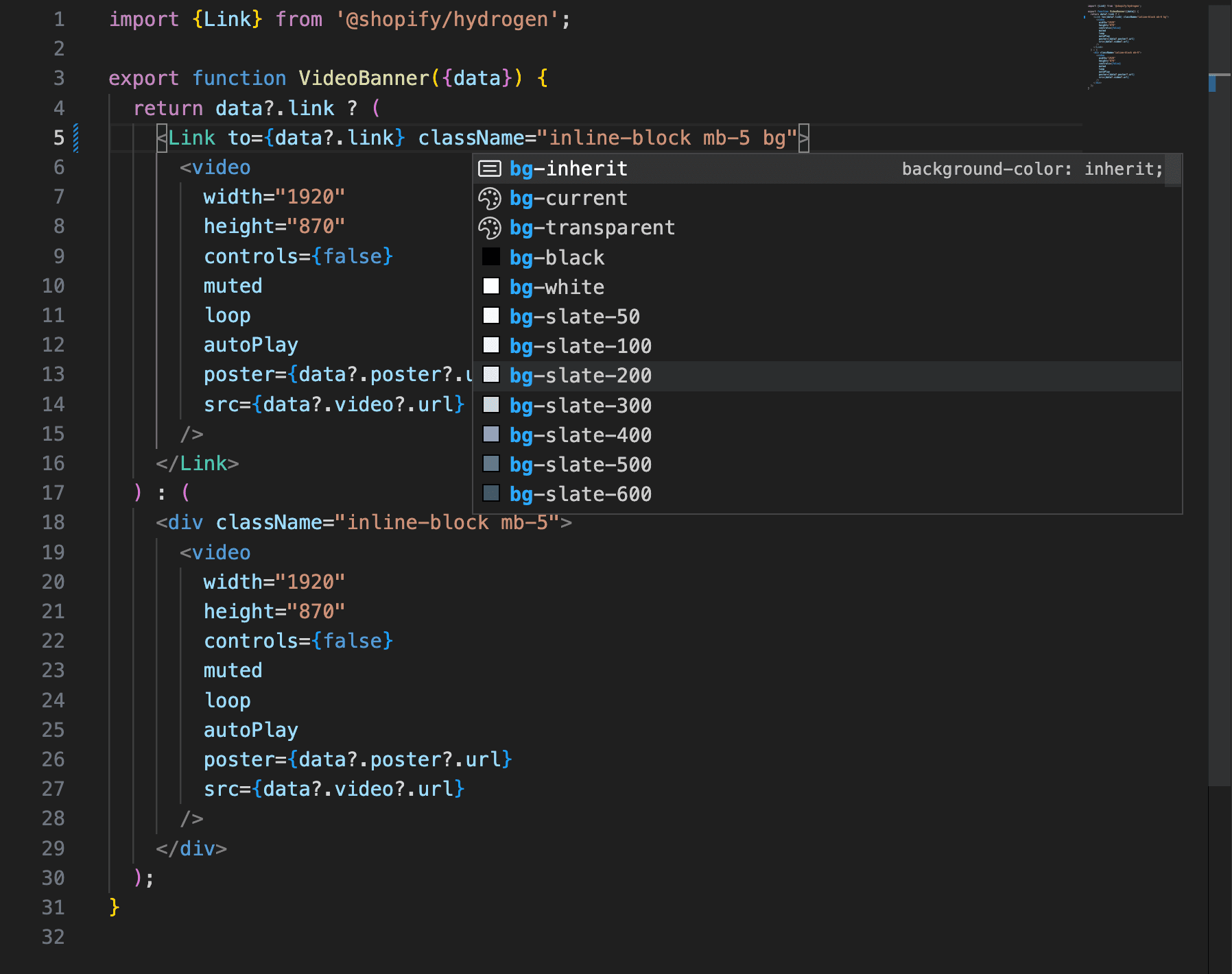
Tailwind also provides plugins for excellent IDE integration. This helps with completion for Tailwind classes in HTML files and completion suggestions for pseudo-class variants. This also provides previews of the resulting CSS when hovering over classes in HTML and CSS files, or on autocompletion.
Pros and Cons
Pros
Tailwind discourages the invention of custom CSS classes. The framework attempts to keep the generated CSS small.
Styling can be achieved without ever leaving the HTML file as all Tailwind CSS classes are annotated right on the elements of the HTML document and covers every aspect of styling.
Tailwind is the CSS framework choice of Shopify, a very popular e-commerce platform.
Cons
According to the principle of Separation of Concerns, the styling part and the logic part of the application should be separate and modularized. This is not the case with Tailwind.
Programmers must be competent with the basic CSS before using Tailwind.
Some rules seem missing. For example, The w-14 and w-16 exist. But w-15 does not. This is because the underlying grid system uses the 16 column system, but the missing w-15 is counter intuitive.
The PurgeCSS system is not without flaws. It cannot scan class names which are dynamically generated, such as this React code with the Tailwind classes:<div className={'w-14 md:w-[' + value + ']'}> ... </div>
The PurgeCSS process will detect w-14, but it will miss the md:w-[value]. The md: part will not be generated in the final CSS file.
Integration with non-Tailwind content is possible but can cause potential conflicts. For example, an imported blog content from a 3rd party API which uses Bootstrap can conflict with Tailwind styling.
Adding custom rules such as a new responsive breakpoint will result in additional codes. For example, we can add “xs:” an even smaller breakpoint to the Tailwind configuration. But, this will result in “xs:w-0”, “xs:w-1”, and will be generated for all the available variations. Tailwind also allows arbitrary values such as “w-[20rem]”. This will also result in “sm:w-[20rem]”, “hover:w-[20rem]”, and so forth. Abusing customization will end up with a bloated code.
The market share of Tailwind has not grown much and stays around 0.5% (2023).
Conclusion
Now that we’ve discussed a few more details about Tailwind, have your feelings changed? While our goal was not to change your mind, it’s good practice to fully understand the underlying concepts within different technologies. So, what did we discuss?
We touched on the beneficial features of Tailwind along with more detailed pros and cons. Tailwind CSS is successful at providing useful pre-built CSS classes which cover every CSS rule. This philosophy helps to keep the project’s CSS size small. However, a gloomy sentiment is that it requires a solid understanding of the basics of CSS.
Nonetheless, CSS competency and willingness to adhere to the “utility-first” approach is fundamental to choosing Tailwind CSS. Overall, we keep this approach in mind when reviewing and adopting new technologies and this approach can help us in future decisions.