
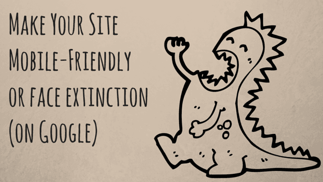
Make Your Website Mobile Friendly or Face Extinction On Google
If your website is not mobile friendly, you could be leaving a lot of money and opportunity on the table. In fact, you could disappear altogether from Google search. Yep, you read that right.

Mobile usage surpassed desktop/laptop usage in 2014
In 2014, mobile exceeded desktop usage so Google decided to make some changes to its algorithm. By April 21, 2015, Google will not serve up non mobile-friendly sites in mobile search results. You can read the full announcement here. But essentially… yikes!
Google isn’t trying to thwart your business. The search engine is simply focusing on the habits and desires of their users in order to continue its longevity and success. And you should be doing the same.
How Can I tell If My Website Is Mobile Friendly?
Before we deep dive into some user behaviors and look at some best practices for mobile-friendly sites, let’s find out how your website rates with Google. To test your site’s user-friendliness, type your URL here and see how Google scores you.
How did you do? If you’re already mobile friendly, congratulations. Now all you have to do is make sure your site has the best user experience possible. We’re going to cover that too so do keep reading.
If you did poorly, it’s high time to make the switch to a responsive design and maintain your visibility. Because, you do not want your website to be left out in the cold from the largest, most-powerful search engine on the planet. Or at best, find your site on the 384th page of Bing. Ouchie.
Is Your Current Website Capitalizing On Mobile User Behavior?
Your online presence has to be right here, right now, because your user expects that. Understanding your user and crafting the best experience for them can only help to make your website popular. Here are just a few of key user behaviors to help you understand why mobile is king.
With more options and choices online, users tend to skim information. If users don’t find what they need within seconds, or if the website is too slow to load, confusing or too dense to navigate from a smartphone… the tendency is to move on or “bounce” away from your site. There goes your opportunity to engage with your user.
It’s also extremely crucial for you to understand how people are using mobile devices.

Pew poll from January of 2014:
90% of American adults have a cell phone
58% of American adults have a smartphone
42% of American adults own a tablet
66% of U.S. consumers use local search to locate a company
When people don’t find what they want on your site, 86% of the time they jump to a competitor
Local searches make up 20% of all internet searches, translating into 2.8 billion Google searches per month
Local searches lead to a same-day purchase 18% of the time, a significant portion of profit that most small businesses can’t afford to lose
78% of local mobile searches result in an offline (store) purchase
74% of people used their smartphones to get directions, recommendations, or other information based on their location
Pretty powerful stuff. Still not convinced you need a mobile-friendly site? Keeping reading.
If You Depend on Your Website to Stay in Business, Get a Responsive Design
In 2009, 1% of internet traffic came from global mobile users. By 2012, the number grew to 13%. In 2014, global mobile traffic grew by 69%. One of the leading reasons for this increase in traffic is consumers shopping using smartphones.
Unless you don’t rely on the internet to make a living or have cornered your particular market and know you will remain on top for a long time to come, leave your website as it is.
But if you’re like the vast majority of the businesses in the U.S., you must make the transition or you will be invisible along with the other 64% of the non mobile-friendly websites.
Please Choose Responsively
There are several ways to make your website mobile friendly. You could have a separate mobile site where your main website is turned into a mobile version optimized for mobile devices, but it’s more work, more expense, and you have to maintain two sites.

Responsive design is one of the most effective ways your site can be mobile friendly
You could have an app version of your website, depending on your business. But… going the app route is not super simple and unless you’re an expert at app marketing, you could miss out on potential customers. App store optimization (ASO) requires its own special SEO, inbound marketing, organic search visibility in the Apple Store, and several other factors you can read about here. Also, only having an app still leaves you with the issue of not popping up on Goggle.
The best way to make your site mobile and Google friendly is to use a responsive design. So what is that? Responsive Design is the best online viewing experience where the information on a website resizes, pans, and scrolls from desktop to mobile devices, across several brands such as Android and Apple. RD uses a single set of code to make this adaptation possible. And you only have one site to maintain.
If you’re not a techy type, there are many content management systems (CMS) out there that have responsive design built right in.
Platforms that do this:
If you’d rather leave all of the design, functionality, and build to someone else, a reputable web development company is the best way to go. A web development company customizes your website so that it intelligently scales to any mobile device, intuitively presenting information that will engage users. Plus, you’ll be indexed on Google and will join the 36% of companies that were smart enough to get on board and be mobile friendly. Huzzah!
Choose Your User and Avoid These Mistakes
Whether you’re building your own responsive website, letting a pro build you one, or just strengthening the mobile-friendly you site you have, here are some important things users (and search engines) super hate:
– Clear, concise information is better than a graphics-heavy site that will slow down the page load. Users hate a slow-loading page and will jump to a competitor in a flash.
Pop-Ups
– Users also hate pop ups. If you’re pushing pop-up ads at your potential customers, they tend to immediately X out of the window. If further pop-ups happen, users bounce.
Unplayable Content
– There’s nothing more frustrating for your customer than clicking on a video and getting the snowy, black window of womp womp. Don’t be that guy. Make checking your links part of a monthly site check up.
Blocking CSS, JavaScripts, or images
– If search engine bots from Google, Bing, or Yahoo can’t read all of the assets on your site, your content is not indexed or rendered. And you’re lost in the digital wilderness.
Unreadable Text Size
– Making your readers use an electron microscope to see the content on your site is a good way to make them click off of your site. Even though smartphones and tablets have various screen sizes, tiny fonts are very hard to read.
Hard to Click Buttons or Links
– Your users need to get clicky with it immediately upon seeing something they like. Choose function over style every time when designing your buttons and links.
He Who Hesitates Is 404
We know that change isn’t always easy but considering that the Google algorithm is looming, it’s time to be the most mobile-friendly website you can be. Being desktop-chained is about as fun for your users as wearing bell bottoms or taping their favorite shows on VHS so… make the switch already.

Plus, you’ve worked too hard to build your business to let it wither in the shadow of the explosive growth of mobile. And, more importantly, now is the time to get ahead of your competition. Change is not just inevitable, it’s good for your business!
Get mobile friendly now!
Endertech has been designing and developing websites since 2000. As a Los Angeles Web Developer agency we know what it takes to create good responsive web design and optimize your site for SEO. Contact us today to talk about how we can help you go mobile!